
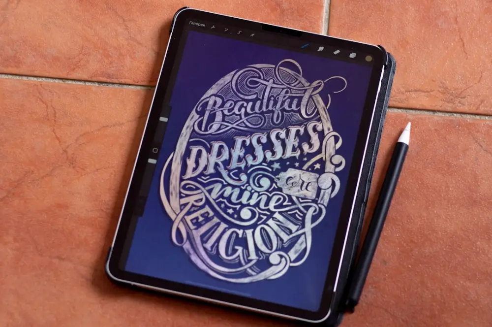
Typography involves the systematic arrangement of pre-designed typefaces to ensure readability and visual harmony within a layout. Conversely, lettering is the specific act of drawing unique, custom characters for a single application. While typography relies on repeatable font files, lettering treats characters as individual illustrations tailored to a specific design context.
Recognizing the boundary between these two disciplines is essential for any designer aiming for structural clarity. Choosing typography is an exercise in managing a system of rules and constraints, while opting for lettering is a decision to break those rules in favor of a singular, expressive gesture. Both require a deep understanding of letterform anatomy to be effective.
Defining Typography: The Art of Arranging Type
Typography is the backbone of most visual communication. It is the practice of using sets of letters that have already been designed—known as typefaces—and arranging them into a coherent structure. When you select a font like Roboto or Garamond from a dropdown menu, you are engaging in typography. The primary goal here is usually utility: ensuring that the reader can absorb information without the design itself becoming an obstacle.
The strength of typography lies in its repeatability. In a typographic system, every "a" is identical to every other "a" in that specific weight and style. This consistency allows for a unified visual language across thousands of pages or screens. For example, when designing a multi-page annual report for a financial institution, a designer uses typography to establish a hierarchy. They set the body text in a highly legible serif, the headings in a bold sans-serif, and the captions in a smaller, lighter weight. The software handles the reproduction of these characters, but the designer handles the spatial relationships between them.
To master typography, one must focus on the micro-details of spacing. Kerning (the space between individual characters), tracking (the overall spacing of a word or line), and leading (the vertical space between lines) are the levers a designer pulls to create balance. A well-set paragraph feels invisible; the reader notices the message, not the mechanics of the letters. This discipline requires a quiet, observant approach to how observation shapes meaningful visual ideas in the way text occupies a page.
Hand Lettering: Drawing Unique Character Forms
Lettering is fundamentally different because it is an act of drawing rather than an act of typesetting. In lettering, each character is a custom-made illustration. If a word contains three "e" characters, a letterer might draw each one slightly differently to fit the specific curves and tensions of the surrounding letters. This is not a system intended for mass-use across a website; it is a bespoke solution for a specific moment.
Consider the masthead of a boutique magazine or a logo for a craft brewery. These often utilize lettering to convey a specific personality that a standard font cannot replicate. The artist might use a brush pen, a digital tablet, or a traditional pointed nib to create forms that are fluid, interlocking, or highly decorative. Because these letters are drawn, they are not bound by the technical limitations of a font file, such as the need for every character to sit on a rigid baseline or fit within a predefined bounding box.
Lettering often starts with a "skeleton"—a simple line representing the basic structure of the letter. The designer then adds "flesh" or weight to that skeleton, deciding where the thick and thin strokes should fall based on the logic of the tool being emulated. A common example is the signage found in high-end grocery stores or chalkboards in cafes, where the letters are constructed to fit a specific physical space, often curving or stretching in ways a digital font never could.
Typography vs. Lettering: Key Differences
The most significant difference between the two is the concept of the "system" versus the "instance." Typography is a system of pre-made parts designed to work together in any combination. Lettering is a single instance of custom work designed for one specific word or phrase. You can buy a typeface and use it to write a novel; you cannot "type" with lettering because the letters are not part of a functioning software file.
Another distinction lies in the tools and the output. Typographers work primarily with existing software and focus on the mathematical relationships between glyphs. They often use tools like Glyphs or FontLab to create the typefaces that others will eventually use. Letterers, however, spend more time in the sketching phase. Whether using Procreate on an iPad or a pencil on tracing paper, the process is closer to illustration than it is to layout design. According to Wikipedia, lettering is often categorized as an art form where the letterform is treated as an object to be decorated or shaped.
In terms of application, typography is about efficiency and scalability. If a brand needs to produce hundreds of social media posts, email newsletters, and internal documents, it needs a typographic system. Lettering, while impactful, does not scale. It is a high-effort, high-reward choice for a centerpiece—like a book cover or a hero image—where the goal is to stand out from the sea of standardized digital type.
Choosing Between Typefaces and Custom Lettering
Deciding which path to take depends on the project’s goals and the intended lifespan of the design. When a project requires a high degree of legibility over long stretches of text, typography is the only logical choice. You would never set a 500-word article in hand-lettering; the lack of consistency would fatigue the reader's eyes and obscure the information. In these cases, the designer looks for the subtle shift toward structural rigor that comes from a well-engineered typeface.
However, when the goal is to create a unique brand identity that feels human and artisanal, lettering is often the superior choice. Custom lettering provides a level of protection against imitation; while anyone can license the same font you used for a logo, no one else has the exact hand-drawn curves of a custom mark. This makes lettering ideal for high-stakes branding where differentiation is the primary objective.
Practical considerations also include budget and time. Typography is generally faster to implement because the heavy lifting of designing the characters has already been done by a type foundry. Lettering requires multiple rounds of sketching, refinement, and vectorization. A designer must weigh the need for a "one-of-a-kind" look against the constraints of the production schedule. Often, a hybrid approach works best: using custom lettering for the logo and a complementary typeface for the supporting text.
Applying Lettering and Type to Modern Branding
In modern branding, the most successful visual identities use a combination of both disciplines to create a layered experience. Think of a global brand like Coca-Cola. The primary logo is a classic example of Spencerian script lettering—it is a unique, drawn mark. However, the company also uses a proprietary typeface for its marketing copy and digital interfaces to ensure that the brand remains recognizable even when the logo isn't present.
In a digital context, typography takes center stage due to the requirements of responsive design. Typefaces must be able to scale from a giant 4K monitor down to a small smartwatch screen without losing clarity. This is where web fonts (WOFF and WOFF2 formats) excel. Lettering is typically used in these environments as static imagery—SVG or PNG files—to provide a focal point of personality without interfering with the site's overall performance or accessibility.
When applying these to a brand, start by defining the "voice" of the project. If the voice is authoritative and institutional, lean into the structural discipline of typography. If the voice is whimsical, personal, or rebellious, lettering can provide the necessary break from convention. The interplay between the two creates a visual tension that keeps a brand from feeling either too rigid or too chaotic.
Practical Steps for Mastering Type and Lettering
For those looking to advance their skills in these areas, the best approach is to treat them as separate but related studies. You cannot be a great letterer without understanding the rules of typography, and you cannot be a truly great typographer without understanding how letters are constructed by hand. Here is a structured way to begin:
- Study Anatomy: Learn the names of every part of a letter—the ascender, descender, x-height, counter, and serif. This knowledge is universal to both disciplines.
- Practice Tracing: Take a classic typeface like Baskerville and trace it by hand. This forces you to notice the subtle weight distributions and curves that the eye usually skips over.
- The Grid Exercise: Design a simple layout using only one typeface in one size and weight. Force yourself to create hierarchy using only white space and alignment. This builds typographic discipline.
- Draw Your Name: Try drawing your own name in three different styles—monolinear, high-contrast, and slab serif. Don't use a font as a guide; draw from your understanding of how the letters should look.
- Vectorization: Take your hand-drawn sketches into a program like Adobe Illustrator. Learn how to use anchor points and handles to create clean, professional curves. This is where lettering meets the digital world.
By alternating between the rigid constraints of typography and the fluid freedom of lettering, you develop a more versatile toolkit. The goal is to move beyond simply "picking a font" and toward a place where you are intentionally constructing visual language. This practice is what separates a technician from a designer who understands the underlying mechanics of communication.
At the studio of Jean Pierre Roy, we emphasize that these skills are not merely decorative. They are the structural components of a visual strategy. Whether you are arranging a system of type or drawing a custom character, the work must be rooted in a clear intent. Jean Pierre Roy views the mastery of typography and lettering as a commitment to ideas that outlast fleeting digital trends. By focusing on the rigor of letterforms, you ensure that your design work remains both functional and enduring, grounded in a tradition of craft that spans centuries.