
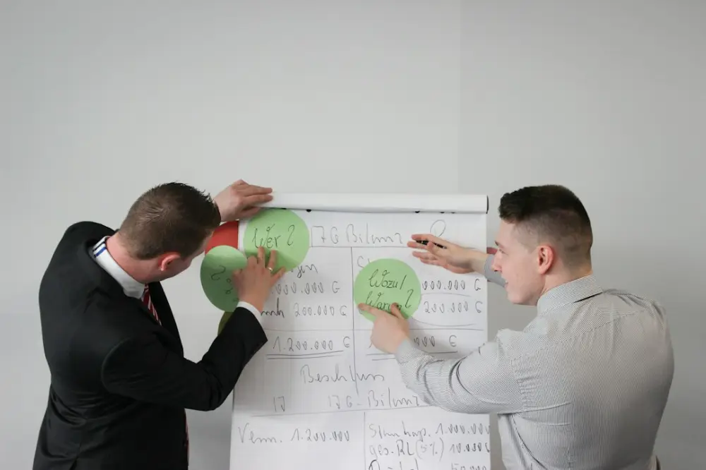
Developing thoughtful visual concepts is the process of translating brand strategy and user data into a cohesive visual language. By aligning creative elements like color and typography with a specific message, designers ensure their work communicates effectively and solves communication challenges rather than serving as mere decoration or following fleeting aesthetic trends.
Treat visuals as functional choices, not decoration. Ask what each line, weight, and hue communicates, then tie those decisions to the project narrative so concept and strategy stay aligned. This rigor depends on understanding the intention in the creative process.
Sync copy and design for a cohesive narrative
Visuals and words are not separate entities; they are two sides of the same communicative coin. When design and copy are developed in isolation, the result is often a disjointed experience where the visual tone contradicts the verbal message. To build a cohesive narrative, the development of visual concepts must happen in tandem with the editorial process.
Consider a scenario where a boutique hotel is launching a new website. If the copy is written with a tone of "rugged adventure" while the design uses delicate, high-contrast serifs and a pastel color palette, the user receives a mixed message. A thoughtful visual concept would sync these elements by using earthy tones, sturdy slab-serif typography, and unpolished, grainy photography to reinforce the ruggedness described in the text.
To achieve this synchronization, follow a structured collaborative process:
- Identify Shared Keywords: Both the writer and the designer should agree on three to five keywords that describe the desired emotional and functional response.
- Audit the Vocabulary: Look at the specific nouns and verbs used in the copy. If the copy uses words like "precision" or "sharp," the visual language should mirror this with crisp edges and mathematical layouts.
- Prototype with Real Content: Avoid using placeholder text like Lorem Ipsum. Designing with the actual copy allows the designer to see how line lengths, headings, and calls to action interact with the visual rhythm.
- Iterative Alignment: Hold review sessions where the focus is on the interplay between the two disciplines. Ask: "Does this image support the promise made in this headline?"
When these elements are in sync, the design becomes invisible in the best way possible—it serves the message so perfectly that the user focuses entirely on the content without being distracted by aesthetic friction.
Align creative execution with brand strategy
A brand strategy is a set of goals and values; creative execution is how those goals are manifested. A common failure in design is creating something that is aesthetically pleasing but strategically hollow. To avoid this, the visual concept must be a direct translation of the brand’s positioning. This requires a deep understanding of the brand’s unique value proposition and its long-term objectives.
For example, if a brand’s strategy is centered on "democratizing luxury," the visual execution must walk a fine line. It cannot look so expensive that it feels unattainable, nor can it look so budget-friendly that it loses its aspirational quality. The visual concept might involve using high-end typographic layouts (wide tracking, generous white space) paired with more accessible imagery of everyday people in relatable settings. This creates a specific tension that communicates the brand’s strategic intent.
Translating strategy into visuals involves analyzing the brand’s attributes and assigning them visual counterparts. If a brand is described as "transparent," the designer might use outline icons, glassmorphism effects, or open-source typography. If the brand is "heritage-focused," the concept might draw from historical archives, using muted colors and traditional grid systems found in early 20th-century print media. This level of rigor ensures that the design is not just a trend-driven skin, but a functional tool that builds brand equity over time.
According to Wikipedia's overview of design strategy, the goal is to align the design of products and services with the business’s strategic goals. This alignment is what separates professional design from hobbyist decoration. Every choice—from the thickness of a rule line to the saturation of a primary color—must be defensible through the lens of the brand strategy.
Inform visual choices with user research
Thoughtful visual concepts are not born in a vacuum; they are informed by the needs, behaviors, and mental models of the target audience. User research provides the raw data necessary to make informed design decisions. Without this data, designers often fall back on their own personal preferences, which may not resonate with the actual users.
Research can take many forms, from qualitative interviews to quantitative heatmaps. For instance, if research shows that a significant portion of the audience accesses a tool in high-stress, time-sensitive environments (such as medical professionals or field engineers), the visual concept should prioritize "utility and speed." This would lead to a high-contrast color palette, large touch targets, and a visual hierarchy that highlights the most critical actions first.
Consider these methods for integrating research into your visual concepting:
- Visual Preference Testing: Show users different aesthetic directions and ask them to associate them with specific adjectives. This helps determine if your visual choices align with the intended brand perception.
- Accessibility Audits: Use research into color blindness and cognitive load to set constraints. These constraints often lead to more creative and robust visual concepts because they force the designer to find solutions that work for everyone.
- Competitor User Sentiment: Analyze what users dislike about the visuals of competing products. If users find a competitor’s interface "cluttered" or "overwhelming," your visual concept can lean into "spaciousness" and "simplicity" as a competitive advantage.
By grounding your visual logic in user data, you create a more objective environment for design reviews. Instead of debating whether a shade of blue is "pretty," the conversation shifts to whether it provides enough contrast for a user in a specific context. This empirical approach builds trust with stakeholders and results in more effective communication tools.
Prototype early to stress-test visual directions
Before you commit to a full campaign look, run small prototypes: mood boards, one-page mockups, or short motion tests. Share them with stakeholders who represent different priorities—brand, product, and audience—so you can see where a concept holds up and where it drifts.
Early prototypes surface mismatches between copy tone and visual weight while changes are still cheap. Schedule a short review with real headline and body copy in the layout, not lorem ipsum, so you can judge hierarchy and emotional tone together.
Map the competitive landscape for unique ideas
To create a visual concept that stands out, you must first understand the visual conventions of the industry. Mapping the competitive landscape involves a systematic audit of the colors, typefaces, and imagery used by others in the same space. The goal is not to copy these conventions, but to identify the "white space" where your brand can exist uniquely.
In many industries, a "category look" emerges. In the sustainability sector, for example, many brands default to shades of green and leaf motifs. A brand that wants to differentiate itself might develop a visual concept around "urban renewal," using industrial textures, neon accents, and architectural grids. This immediately signals to the audience that the brand is offering a different perspective, even though it operates in the same sector.
A practical way to map the visual field is to create a visual matrix. Place competitors on an axis—for example, "Traditional vs. Modern" and "Minimalist vs. Maximalist." Once you see where the majority of competitors cluster, you can intentionally position your visual concept in an unoccupied quadrant. This differentiation is vital for brand recall and helps the audience distinguish your message from the noise of the market.
Ultimately, the most enduring visual concepts are those that are rooted in disciplined observation. When you understand how observation shapes meaningful visual ideas, you can see patterns and tensions that others overlook. This level of awareness allows you to move beyond the surface and build visual systems that have structural rigor and long-term relevance.
First steps for applying these visual strategies
- Start by identifying the core brand strategy goals that the visual concept must solve and translating them into tangible emotional attributes.
- Establish the intention in the creative process to ensure every aesthetic choice is defensible.
- To begin the collaborative phase, meet with the editorial team to align on a shared set of keywords that bridge the gap between copy and design.
- Next, use how observation shapes meaningful visual ideas to audit competitor visuals and find unique opportunities in the market.
- Finally, create a low-fidelity prototype using real content to stress-test the visual hierarchy and narrative before moving into high-fidelity production.
At the core of this practice is the belief that design is a form of thinking. By employing these strategies, Jean Pierre Roy emphasizes that visual communication should be as rigorous as the strategy it supports. Whether you are syncing copy with design or mapping a competitive visual field, the goal is always the same: to create work that is intentional, clear, and capable of outlasting the trends of the day. This commitment to structural rigor and thoughtful concepting is what ensures that a design doesn't just look good in 2026, but remains effective for years to come.